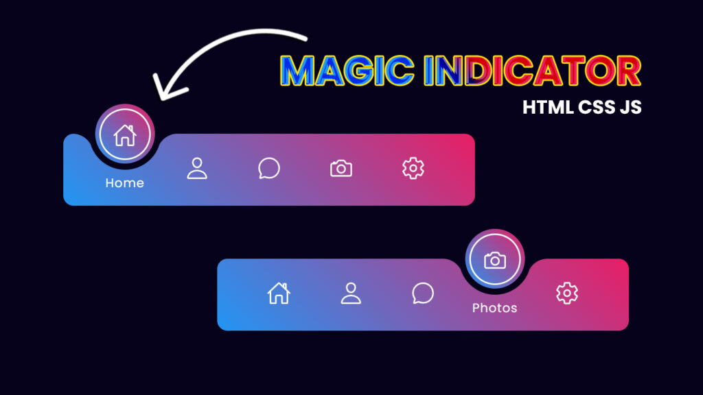
Hello guys! In this blog, we will learn how to create magic navigation menu indicator using HTML CSS and Javascript.
Hey, guys and gals, gather round!!! We’re about to spill the tea on something that’s making websites go from basic to extra, it’s all about the magic navigation menu indicator with the coolest active tab animations. So, let’s break it down, see what’s up, and why these are changing the game for web users.
Video Tutorial:
You can also watch a video tutorial on this blog, “Magic Navigation Menu Indicator using HTML CSS and Javascript – Animated Navigation Menu Bar”, in the video below.
What’s the Deal with Magic Navigation Menu Indicators?
First things first, what’s a “magic navigation menu indicator”?? Well, it’s like the sparkle in your web navigation. This thing is a moving, animated part of the menu that shows where you are on a website. It’s all about making the menu interactive and showing off some serious website magic.
Magic comes in when this indicator does its thing with animations. When you click a menu item, it doesn’t just sit there, it might change colors, move, or get all fancy to show it’s the one you’re on.
How’s This Magic Indicator Work?
Alright, let’s spill the deets on how this magic indicator works. Here’s the lowdown:
User Action: It all starts when you, the user, click a menu item. You’re the one who kicks off the magic.
Indicator in Action: The magic indicator jumps into action when you click on a menu item. It figures out which one you’re on right now.
Lights, Camera, Animation: Now, here’s the cool part. The indicator starts to move and shake. It changes colors, does funky stuff, or just stands out in a way that makes you go, “Woww!” That’s your active tab, showing where you are.
Guiding the Way: The whole point of this magic indicator is to guide you. It helps you know where you are on the website and what you’re looking at. It’s like your trusty tour guide on a digital adventure.
Keeping it Consistent: The magic indicator is usually designed to look the same and act the same for all menu items and web pages. This makes the whole website experience smooth and on point.
Why Active Tab Animations Matter
Active tab animations are like the secret sauce that makes this magic indicator pop. They have some super important jobs that make your website experience better:
You’re Never Lost: Active tab animations are your GPS. They tell you exactly where you are on the website, so you’re never lost in cyberspace.
Eyes on the Prize: These animations catch your eye. They make you notice the active tab, so you don’t miss a thing.
Instant Feedback: The animations let you know that your actions on the website matter. When you click or hover, they respond, giving you instant feedback.
Lookin Good: Beyond being useful, these animations add some extra style to the website. They make it look sharp and unforgettable.
Folder Structure:
First, you make a folder with any name, for example, “magic navigation menu”, Inside that folder are html, css and javascript files, and you can give them any name, for example, “index.html” for html file, “style.css” for css file and “script.js” for javascript file.
Source Files – Magic Navigation Menu Indicator
HTML Code:
<!DOCTYPE html>
<html lang="en">
<head>
    <meta charset="UTF-8">
    <meta http-equiv="X-UA-Compatible" content="IE=edge">
    <meta name="viewport" content="width=device-width, initial-scale=1.0">
    <title>Magic Navigation Menu Indicator | Codehal</title>
    <link rel="stylesheet" href="style.css">
</head>
<body>
    <div class="navigation">
        <ul>
            <li class="list active">
                <a href="#">
                    <span class="icon">
                        <ion-icon name="home-outline"></ion-icon>
                    </span>
                    <span class="text">Home</span>
                    <span class="circle"></span>
                </a>
            </li>
            <li class="list">
                <a href="#">
                    <span class="icon">
                        <ion-icon name="person-outline"></ion-icon>
                    </span>
                    <span class="text">Profile</span>
                    <span class="circle"></span>
                </a>
            </li>
            <li class="list">
                <a href="#">
                    <span class="icon">
                        <ion-icon name="chatbubble-outline"></ion-icon>
                    </span>
                    <span class="text">Message</span>
                    <span class="circle"></span>
                </a>
            </li>
            <li class="list">
                <a href="#">
                    <span class="icon">
                        <ion-icon name="camera-outline"></ion-icon>
                    </span>
                    <span class="text">Photos</span>
                    <span class="circle"></span>
                </a>
            </li>
            <li class="list">
                <a href="#">
                    <span class="icon">
                        <ion-icon name="settings-outline"></ion-icon>
                    </span>
                    <span class="text">Settings</span>
                    <span class="circle"></span>
                </a>
            </li>
            <div class="indicator"></div>
        </ul>
    </div>
    <script type="module" src="https://unpkg.com/ionicons@5.5.2/dist/ionicons/ionicons.esm.js"></script>
    <script nomodule src="https://unpkg.com/ionicons@5.5.2/dist/ionicons/ionicons.js"></script>
    <script src="script.js"></script>
</body>
</html>
CSS Code:
@import url('https://fonts.googleapis.com/css2?family=Poppins:wght@300;400;500;600;700;800;900&display=swap');
* {
    margin: 0;
    padding: 0;
    box-sizing: border-box;
    font-family: 'Poppins', sans-serif;
}
body {
    display: flex;
    justify-content: center;
    align-items: center;
    min-height: 100vh;
    background: #06021b;
}
.navigation {
    position: relative;
    width: 400px;
    height: 70px;
    background: linear-gradient(45deg, #2196f3, #e91e63);
    display: flex;
    justify-content: center;
    align-items: center;
    border-radius: 10px;
}
.navigation ul {
    display: flex;
    width: 350px;
}
.navigation ul li {
    position: relative;
    width: 70px;
    height: 70px;
    list-style: none;
    z-index: 1;
}
.navigation ul li a {
    position: relative;
    display: flex;
    justify-content: center;
    align-items: center;
    flex-direction: column;
    width: 100%;
    text-align: center;
    font-weight: 500;
}
.navigation ul li a .icon {
    position: relative;
    display: block;
    line-height: 75px;
    font-size: 1.5em;
    text-align: center;
    color: #fff;
    transition: .5s;
}
.navigation ul li.active a .icon {
    transform: translateY(-32px);
}
.navigation ul li a .text {
    position: absolute;
    color: #fff;
    font-weight: 400;
    font-size: .75em;
    letter-spacing: .05em;
    opacity: 0;
    transform: translateY(20px);
    transition: .5s;
}
.navigation ul li.active a .text {
    opacity: 1;
    transform: translateY(10px);
}
.navigation ul li a .circle {
    position: absolute;
    display: block;
    width: 50px;
    height: 50px;
    background: transparent;
    border-radius: 50%;
    border: 1.8px solid #fff;
    transform: translateY(-37px) scale(0);
}
.navigation ul li.active a .circle {
    transition: .5s;
    transition-delay: .5s;
    transform: translateY(-37px) scale(1);
}
.indicator {
    position: absolute;
    top: -50%;
    width: 70px;
    height: 70px;
    background: linear-gradient(45deg, #2196f3, #e91e63);
    border: 6px solid #06021b;
    border-radius: 50%;
    display: flex;
    justify-content: center;
    align-items: center;
    transition: .5s;
}
.indicator::before {
    content: '';
    position: absolute;
    top: 50%;
    left: -22px;
    width: 20px;
    height: 20px;
    background: transparent;
    border-top-right-radius: 20px;
    box-shadow: 1px -10px 0 #06021b;
}
.indicator::after {
    content: '';
    position: absolute;
    top: 50%;
    right: -22px;
    width: 20px;
    height: 20px;
    background: transparent;
    border-top-left-radius: 20px;
    box-shadow: -1px -10px 0 #06021b;
}
.navigation ul li:nth-child(1).active~.indicator {
    transform: translateX(calc(70px * 0));
}
.navigation ul li:nth-child(2).active~.indicator {
    transform: translateX(calc(70px * 1));
}
.navigation ul li:nth-child(3).active~.indicator {
    transform: translateX(calc(70px * 2));
}
.navigation ul li:nth-child(4).active~.indicator {
    transform: translateX(calc(70px * 3));
}
.navigation ul li:nth-child(5).active~.indicator {
    transform: translateX(calc(70px * 4));
}
JavaScript Code:
const list = document.querySelectorAll('.list');
function activeLink() {
    list.forEach((item) =>
    item.classList.remove('active'));
    this.classList.add('active');
}
list.forEach((item) =>
item.addEventListener('click',activeLink));
Conclusion
Magic navigation menu indicators with active tab animations are the real deal when it comes to enhancing the web experience. They’re not just guides, they’re your partners on the web journey. These dynamic elements help you navigate, keep you engaged, and give you that instant feedback that makes you feel in control..
As web design keeps evolving, we’ll see even cooler uses of magic navigation menu indicators. They’re the ones casting the spell that makes websites more fun, interactive, and user friendly. So, keep your eyes peeled for the magic as it continues to work its charm on websites across the digital realm, turning your online adventures into something truly enchanting.