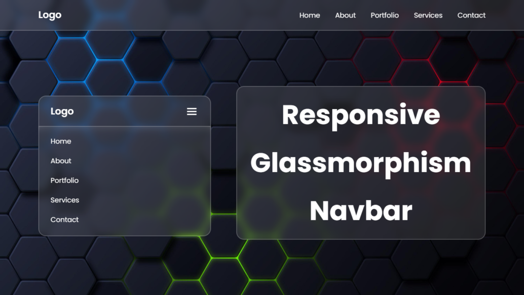
Hello everyone! In this blog, we will learn how to create responsive glassmorphism navbar html css.
Heyy there, let’s talk about some seriously cool web design stuff, responsive glassmorphism navbar and those epic hover effects that’ll make your site pop. Get ready to explore the awesomeness!!
Breaking Down Responsive Glassmorphism Navbar
So.. responsive glass navbars bring together the sleek look of Glassmorphism with the ability to flex and adapt to different screen sizes. It’s like a combo that takes your navigation to the next level while keeping that glassy, cool style.
Glassmorphism Vibes
Glassmorphism is all about giving your website that frosted glass look. It’s transparent, with blurred backgrounds, and keeps things clean and minimal. It’s all about making your site look modern and chic.
Go Responsive
In a world where people use all kinds of devices, being responsive is a must. A responsive Glassmorphism navbar ensures that your users have a smooth and consistent experience, whether they’re on a big computer screen or a tiny smartphone.
Adaptability Matters
What’s super cool about responsive Glassmorphism navbars is their ability to change and fit perfectly on any screen. They’re like chameleons that adjust without losing their looks or functionality.
Hover Effects – The Ultimate Charm
Responsive Glassmorphism navbar are already cool, but when you add those extra hover effects, your site becomes irresistible. These effects bring your navbar to life, making it fun to explore.
Awesome Animation
Hover effects often come with rad animations that respond when users hover their cursor over a navigation item and navbar itself. It’s like your website is doing a little dance just for you. These animations make your site engaging and fun to navigate.
Super Smooth
Smooth transitions are the name of the game. Whether you’re hovering over a navbar link or navbar itself, the change should be silky smooth. No awkward movements here, just a slick user experience.
Highlight the Good Stuff
Hover effects can also help you emphasize what’s important. When you hover over something, like a “Login” link, it might start shining brighter. It’s like your site is saying, “Heys, this is important, click me!”, It’s a clever way to guide users to what they need..
How to Create the Magic
Ready to add this web design magic to your projects??, Let’s break it down and make your responsive Glass navbars equipped with beautiful hover effects a reality.
Keep HTML in Order
Your HTML structure matters a lot. Each navigation item should be nicely organized with HTML elements that you can easily style with CSS. Clean and well structured code is the foundation for a killer website.
Get Creative with CSS
CSS (Cascading Style Sheets) is where the magic begins. It’s like the artist’s toolbox for web design. CSS helps you create that frosted glass look, control transparency, and add those epic hover effects. You’ve got the freedom to customize and bring your creative ideas to life.
Video Tutorial:
You can also watch a video tutorial on this blog, “Responsive Glassmorphism Navbar CSS”, in the video below. Everything is done step by step, you can check out this video.
Source Files – Glass Navbar
HTML Code:
<!DOCTYPE html>
<html lang="en">
<head>
    <meta charset="UTF-8">
    <meta http-equiv="X-UA-Compatible" content="IE=edge">
    <meta name="viewport" content="width=device-width, initial-scale=1.0">
    <title>Responsive Glassmorphism Navbar HTML CSS JS | Codehal</title>
    <link rel="stylesheet" href="style.css">
    <link href='https://unpkg.com/boxicons@2.1.4/css/boxicons.min.css' rel='stylesheet'>
</head>
<body>
    <header class="header">
        <a href="#" class="logo">Logo</a>
        <i class='bx bx-menu' id="menu-icon"></i>
        <nav class="navbar">
            <a href="#">Home</a>
            <a href="#">About</a>
            <a href="#">Portfolio</a>
            <a href="#">Services</a>
            <a href="#">Contact</a>
        </nav>
    </header>
    <div class="nav-bg"></div>
    <script src="script.js"></script>
</body>
</html>
CSS Code:
@import url("https://fonts.googleapis.com/css2?family=Poppins:wght@300;400;500;600;700;800;900&display=swap");
* {
  margin: 0;
  padding: 0;
  box-sizing: border-box;
  font-family: "Poppins", sans-serif;
}
body {
  min-height: 100vh;
  background: url("background.jpg") no-repeat;
  background-size: cover;
  background-position: center;
}
.header {
  position: fixed;
  top: 0;
  left: 0;
  width: 100%;
  padding: 20px 100px;
  background: rgba(255, 255, 255, 0.1);
  display: flex;
  justify-content: space-between;
  align-items: center;
  backdrop-filter: blur(10px);
  border-bottom: 2px solid rgba(255, 255, 255, 0.2);
  z-index: 100;
}
.header::before {
  content: "";
  position: absolute;
  top: 0;
  left: -100%;
  width: 100%;
  height: 100%;
  background: linear-gradient(
    90deg,
    transparent,
    rgba(255, 255, 255, 0.4),
    transparent
  );
  transition: 0.5s;
}
.header:hover::before {
  left: 100%;
}
.logo {
  color: #fff;
  font-size: 25px;
  text-decoration: none;
  font-weight: 600;
  cursor: default;
}
.navbar a {
  color: #fff;
  font-size: 18px;
  text-decoration: none;
  margin-left: 35px;
  transition: 0.3s;
}
.navbar a:hover {
  color: #f00;
}
#menu-icon {
  font-size: 36px;
  color: #fff;
  display: none;
}
/* BREAKPOINTS */
@media (max-width: 992px) {
  .header {
    padding: 1.25rem 4%;
  }
}
@media (max-width: 768px) {
  #menu-icon {
    display: block;
  }
  .navbar {
    position: absolute;
    top: 100%;
    left: 0;
    width: 100%;
    padding: 0.5rem 4%;
    display: none;
  }
  .navbar.active {
    display: block;
  }
  .navbar a {
    display: block;
    margin: 1.5rem 0;
  }
  .nav-bg {
    position: absolute;
    top: 79px;
    left: 0;
    width: 100%;
    height: 295px;
    background: rgba(255, 255, 255, 0.1);
    border-bottom: 2px solid rgba(255, 255, 255, 0.2);
    backdrop-filter: blur(10px);
    z-index: 99;
    display: none;
  }
  .nav-bg.active {
    display: block;
  }
}
JavaScript Code:
const menuIcon = document.querySelector('#menu-icon');
const navbar = document.querySelector('.navbar');
const navbg = document.querySelector('.nav-bg');
menuIcon.addEventListener('click', () => {
    menuIcon.classList.toggle('bx-x');
    navbar.classList.toggle('active');
    navbg.classList.toggle('active');
});
Wrapping It Up
In the world of web design, it’s all about creating a site that looks amazing and engages users. Responsive Glassmorphism navbars and epic hover effects are the secret ingredients for a fantastic web experience.
So, whether you’re working on a business site, a personal portfolio, or any other project, consider adding some Glassmorphism and hover effects. Your visitors will be blown away by the style, and you’ll keep them coming back for more.