Hello guys!! In this blog, we will learn how to make glass navbar using HTML and CSS.
In the ever evolving landscape of web design, creativity knows no bounds. One of the latest trends making waves in the design community is the Glass navbar, complemented by breathtaking hover effects. In this blog post, we’ll dive into what a Glass navbar is, explore its captivating features, and delve into the artistry of stunning hover effects that elevate user interfaces.
Video Tutorial of Glass Navbar HTML CSS
“Glass Navbar CSS” in the video below. Everything is done step by step, you can check out this video.
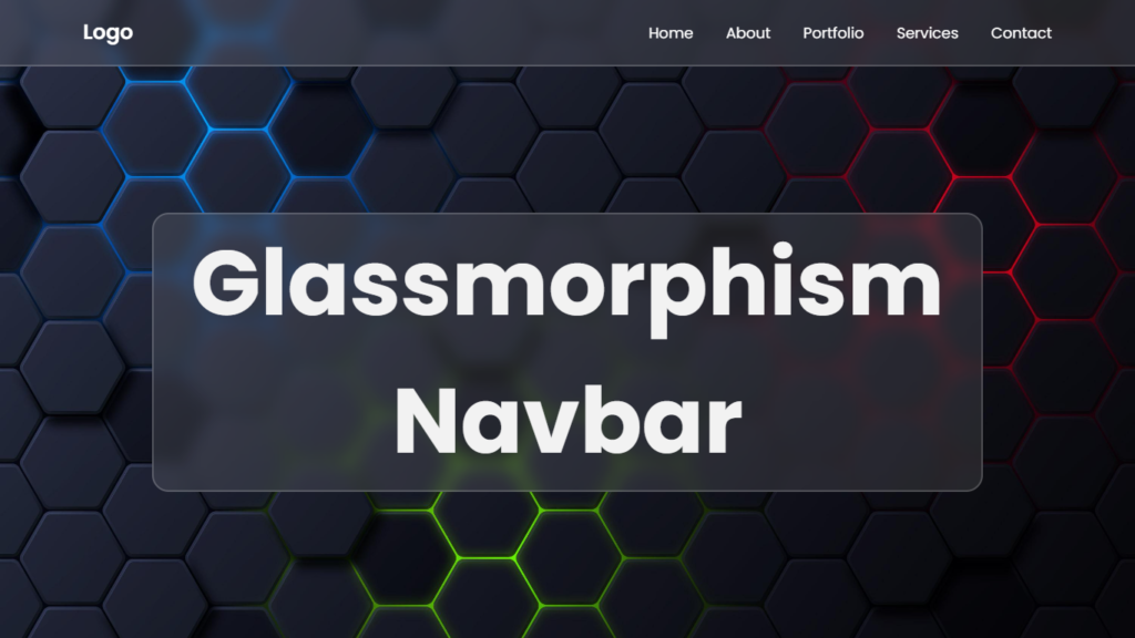
Getting Real with Glassmorphism Navbar
A Glassmorphism navbar??? Yupss, it’s all about that sleek and transparent vibe, like you’re peeping through frosted glass. It adds depth to your webpage and makes it look next level fresh.
Transparent Swag
The Glassmorphism navbar is all about that see through game. It is like a glass sheet with layers underneath, giving your website a super cool 3D look..
Frosted Magic
Imagine a window with a frosted glass effect. That’s the deal with Glassmorphism. It blurs what’s behind it in a classy, elegant way. It’s like the icing on the web design cake.
Simplicity Rules
Keeping it clean and simple is the name of the game. Glassmorphism navbars are all about minimalistic style, clean lines, and essential navigation elements.
The Hype About Hover Effects
But wait, there’s more! Pair up a Glass navbar with some epic hover effects, and you’ve got yourself a web design masterpiece.
Subtle Animations
Hover effects bring the vibes with subtle animations. When you hover over a link, it can change color, move a bit, or even glow.. It’s like the website is talking back to you.
Sparkling Effect On Hover Glassmorphism Navbar
Smooth transitions are key. When you hover on glass navbar, it should switch up gracefully, like a pro dancer on the floor. No clunky transitions here, only smooth moves.
Highlight the Cool Stuff
Hover effects can also make things pop. Imagine you hover over “Navbar Link” and it shines even brighter or change color. It’s like saying, “Hoey, this is important!!!” and inviting you to check it out.
Creating the Magic
Ready to bring this web design magic to your own projects? Let’s break down how to make Glass navbar and epic hover effects a reality.
HTML Structure
Gotta keep things organized, fam! Make sure your HTML is on point. Each navigation item needs to be set up with HTML elements that you can easily style with CSS. Clean and organized code is key for a killer website.
CSS Wizardry
CSS is where the real magic happens. It’s how you create that frosted glass look, control transparency, and add those dope hover effects. CSS is like your artistic paintbrush for web design.
Seeing it in Action
Let’s peep some real life examples where Glassmorphism navbar and epic hover effects take center stage:
Portfolio Websites
Creatives like programmers use Glassmorphism and hover effects to showcase their talent. The slick animations and interactive navigation give their portfolios a wow factor.
E-commerce Platforms
E-commerce websites bring the heat with Glassmorphism navbar and hover effects. When you hover over product categories, it is like a mini fireworks show. They highlight the hottest items and make shopping a blast.
You Might Also Like This:
Source Files – Glass Navbar HTML CSS
HTML Code:
<!DOCTYPE html>
<html lang="en">
<head>
    <meta charset="UTF-8">
    <meta http-equiv="X-UA-Compatible" content="IE=edge">
    <meta name="viewport" content="width=device-width, initial-scale=1.0">
    <title>Glassmorphism Navbar HTML CSS | Codehal</title>
    <link rel="stylesheet" href="style.css">
</head>
<body>
    <header class="header">
        <a href="#" class="logo">Logo</a>
        <nav class="navbar">
            <a href="#">Home</a>
            <a href="#">About</a>
            <a href="#">Portfolio</a>
            <a href="#">Services</a>
            <a href="#">Contact</a>
        </nav>
    </header>
</body>
</html>
CSS Code:
@import url('https://fonts.googleapis.com/css2?family=Poppins:wght@300;400;500;600;700;800;900&display=swap');
* {
    margin: 0;
    padding: 0;
    box-sizing: border-box;
    font-family: 'Poppins', sans-serif;
}
body {
    min-height: 100vh;
    background: url('background.jpg') no-repeat;
    background-size: cover;
    background-position: center;
}
.header {
    position: fixed;
    top: 0;
    left: 0;
    width: 100%;
    padding: 20px 100px;
    background: rgba(255, 255, 255, .1);
    display: flex;
    justify-content: space-between;
    align-items: center;
    backdrop-filter: blur(10px);
    border-bottom: 2px solid rgba(255, 255, 255, .2);
}
.header::before {
    content: '';
    position: absolute;
    top: 0;
    left: -100%;
    width: 100%;
    height: 100%;
    background: linear-gradient(90deg, transparent, rgba(255, 255, 255, .4), transparent);
    transition: .5s;
}
.header:hover::before {
    left: 100%;
}
.logo {
    color: #fff;
    font-size: 25px;
    text-decoration: none;
    font-weight: 600;
    cursor: default;
}
.navbar a {
    color: #fff;
    font-size: 18px;
    text-decoration: none;
    margin-left: 35px;
    transition: .3s;
}
.navbar a:hover {
    color: #f00;
}
Conclusion
In the world of web design, it’s all about the looks and the vibes. Glassmorphism navbar and hover effects are your ticket to creating a website that’s visually stunning and seriously engaging. So, whether you’re working on a portfolio, an online store, or any website, consider adding some Glassmorphism magic and epic hover effects. Your visitors will be blown away by the style and user friendly vibes you bring to the table.