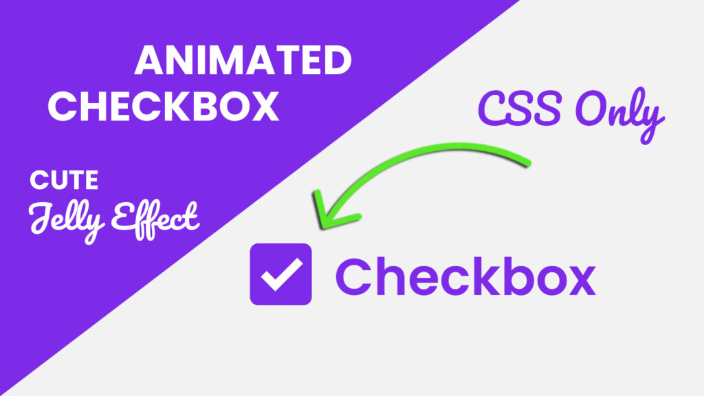
Hello coders! In this blog post, we will learn how to make custom checkbox CSS – animated checkbox using HTML and CSS. In the dynamic world of web design, user experience (UX) plays a pivotal role in capturing and retaining audience attention. Developers and designers are constantly seeking innovative ways to enhance the visual appeal and functionality of user interfaces. One such element that has gained popularity for its ability to elevate UX is the custom checkbox with animation.
Video Tutorial Of Custom Checkbox CSS
Understanding the Basics
Before delving into the intricacies of custom checkboxes with animation, let’s revisit the humble checkbox. Traditionally, checkboxes are simple, utilitarian elements used for binary decision-making on web forms. They are fundamental in web design, allowing users to make selections or express preferences effortlessly.
However, as web design evolves, so do user expectations. Enter custom checkboxes with animation, a contemporary twist that transforms the mundane checkbox into an engaging and visually pleasing component.
What is a Custom Checkbox?
A custom checkbox is a stylized version of the standard checkbox, designed to align with the overall aesthetics of a website or application. Unlike the default checkboxes provided by browsers, custom checkboxes offer designers the freedom to customize their appearance, making them seamlessly integrate with the overall design language.
Custom checkboxes are often created using HTML, CSS, and JavaScript. They allow designers to experiment with shapes, colors, and animations, providing a more cohesive and branded user experience.
Adding Animation to the Mix
While custom checkboxes alone offer a fresh look, incorporating animation takes the user experience to a whole new level. Animation adds an element of interactivity, making the interface more engaging and enjoyable for users.
Common animations applied to custom checkboxes include transitions, fades, and transforms. For instance, a subtle fade when a user checks a box or a smooth transition between the checked and unchecked states can significantly enhance the visual appeal. These animations are not just eye candy, they contribute to a smoother and more intuitive user interaction.
Advantages of Custom Checkboxes with Animation
Brand Consistency
Custom checkboxes allow designers to maintain brand consistency across the entire interface. By incorporating brand colors, shapes, and styles, checkboxes become an extension of the overall design language, reinforcing brand identity.
Enhanced User Engagement
Animations bring a touch of delight to the user experience. Interactive elements, such as smoothly transitioning checkboxes, create a sense of responsiveness, making users feel more connected to the interface.
Reduced Cognitive Load
Well-designed animations provide visual cues that help users understand the state changes of checkboxes more intuitively. This reduces cognitive load, making the interface user-friendly and easy to navigate.
You Might Also Like This:
Source Files – Animated Checkbox HTML CSS
HTML Code
<!DOCTYPE html>
<html lang="en">

<head>
    <meta charset="UTF-8">
    <meta http-equiv="X-UA-Compatible" content="IE=edge">
    <meta name="viewport" content="width=device-width, initial-scale=1.0">
    <title>Custom Checkbox Animation | Codehal</title>
    <link rel="stylesheet" href="style.css">
</head>

<body>

    <label>
        <input type="checkbox">
        <span class="input-check"></span>
        Checkbox
    </label>

</body>

</html>
CSS Code
@import url('https://fonts.googleapis.com/css2?family=Poppins:wght@600&display=swap');

* {
    margin: 0;
    padding: 0;
    box-sizing: border-box;
    font-family: 'Poppins', sans-serif;
}

body {
    display: flex;
    justify-content: center;
    align-items: center;
    min-height: 100vh;
    background: #f2f2f2;
}

label {
    position: relative;
    font-size: 25px;
    color: #7d2ae8;
    cursor: pointer;
}

label input {
    position: absolute;
    opacity: 0;
}

.input-check {
    position: relative;
    display: inline-block;
    top: 5px;
    width: 30px;
    height: 30px;
    border: 2px solid #ccc;
    border-radius: 4px;
    margin-right: 5px;
    transition: .5s;
}

label input:checked~.input-check {
    background: #7d2ae8;
    border-color: #7d2ae8;
    animation: animate .7s ease;
}

@keyframes animate {
    0% {
        transform: scale(1);
    }

    40% {
        transform: scale(1.3, .7);
    }

    55% {
        transform: scale(1);
    }

    70% {
        transform: scale(1.2, .8);
    }

    80% {
        transform: scale(1);
    }

    90% {
        transform: scale(1.1, .9);
    }

    100% {
        transform: scale(1);
    }
}

.input-check::before {
    content: '';
    position: absolute;
    top: 6px;
    left: 4px;
    width: 15px;
    height: 6px;
    border-bottom: 4px solid #fff;
    border-left: 4px solid #fff;
    transform: scale(0) rotate(-45deg);
    transition: .5s;
}

label input:checked~.input-check::before {
    transform: scale(1) rotate(-45deg);
}
Conclusion
Custom checkboxes with animation represent a fusion of design and functionality that can significantly enhance the user experience. By investing time in creating visually appealing and interactive checkboxes, designers contribute to a more engaging and memorable interface. As web design continues to evolve, these small but impactful details will play an increasingly crucial role in setting interfaces apart and leaving a lasting impression on users. So, go ahead, experiment with custom checkboxes and animation, your users will thank you for it.