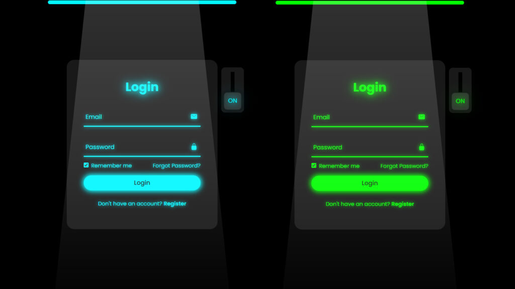
Hello everyone! In this blog post, we will learn how to make a login form animation CSS. In the realm of web development, HTML and CSS stand as the backbone of crafting visually appealing and functional user interfaces. Among the many elements that contribute to an engaging user experience, login form animations hold a special place. These dynamic and subtle visual cues elevate the interaction between users and interfaces, making the login process not just functional but also enjoyable.
Video Tutorial Of Login Form Animation CSS
HTML, the markup language that structures web content, serves as the canvas on which these animations are displayed. A login form in HTML acts as the framework for user input, while CSS, the styling language, brings life to this structure through animations. By combining these two languages, developers can create captivating login experiences that stand out.
Animations in login forms implemented through HTML and CSS serve multiple purposes. They provide immediate visual feedback to users, signaling successful inputs, errors, or transitions within the login process. Simple yet effective animations like color changes, transitions, or subtle movements can significantly enhance the overall user experience.
Creating these animations involves understanding CSS animations and transitions. CSS animations allow developers to gradually change an element’s style over a set period, enabling smooth transitions and engaging visual effects. Transitions, on the other hand, control the animation speed and timing, ensuring a seamless and polished login interface.
For instance, a CSS animation can be employed to highlight an input field when it gains focus, providing a clear visual indication to users. Additionally, transitions can be utilized to smoothen the change in color when a user enters incorrect information, offering immediate feedback without overwhelming the user.
Moreover, HTML and CSS provide the flexibility to personalize login form animations according to brand aesthetics. By aligning animations with a brand’s colors, style, and tone, developers can create a cohesive and memorable experience that resonates with users long after they’ve logged in.
Implementing login form animations requires a careful balance between creativity and functionality. While animations enhance the interface’s visual appeal, excessive or overly complex animations can hinder the login process, causing frustration for users. Thus, developers need to strike a balance, ensuring that animations complement the login flow without impeding usability.
Source Files – Login Form Animation CSS
HTML Code
<!DOCTYPE html>
<html lang="en">

<head>
    <meta charset="UTF-8">
    <meta http-equiv="X-UA-Compatible" content="IE=edge">
    <meta name="viewport" content="width=device-width, initial-scale=1.0">
    <title>Login Form Animation CSS | Codehal</title>
    <link rel="stylesheet" href="style.css">
</head>

<body>

    <div class="login-light"></div>
    <div class="login-box">
        <form action="#">
            <input type="checkbox" class="input-check" id="input-check">
            <label for="input-check" class="toggle">
                <span class="text off">off</span>
                <span class="text on">on</span>
            </label>
            <div class="light"></div>

            <h2>Login</h2>
            <div class="input-box">
                <span class="icon">
                    <ion-icon name="mail"></ion-icon>
                </span>
                <input type="email" required>
                <label>Email</label>
                <div class="input-line"></div>
            </div>
            <div class="input-box">
                <span class="icon">
                    <ion-icon name="lock-closed"></ion-icon>
                </span>
                <input type="password" required>
                <label>Password</label>
                <div class="input-line"></div>
            </div>
            <div class="remember-forgot">
                <label><input type="checkbox"> Remember me</label>
                <a href="#">Forgot Password?</a>
            </div>
            <button type="submit">Login</button>
            <div class="register-link">
                <p>Don't have an account? <a href="#">Register</a></p>
            </div>
        </form>
    </div>


    <script type="module" src="https://unpkg.com/ionicons@5.5.2/dist/ionicons/ionicons.esm.js"></script>
    <script nomodule src="https://unpkg.com/ionicons@5.5.2/dist/ionicons/ionicons.js"></script>
</body>

</html>
CSS Code
@import url('https://fonts.googleapis.com/css2?family=Poppins:wght@300;400;500;600;700;800;900&display=swap');

* {
    margin: 0;
    padding: 0;
    box-sizing: border-box;
    font-family: 'Poppins', sans-serif;
}

body {
    display: flex;
    justify-content: center;
    align-items: center;
    min-height: 100vh;
    background: #000;
    overflow: hidden;
}

.login-box {
    position: relative;
    width: 400px;
    height: 450px;
    background: #191919;
    border-radius: 20px;
    display: flex;
    justify-content: center;
    align-items: center;
}

h2 {
    font-size: 2em;
    color: #fff;
    text-align: center;
    transition: .5s ease;
}

.input-check:checked~h2 {
    color: #00f7ff;
    text-shadow:
        0 0 15px #00f7ff,
        0 0 30px #00f7ff;
}

.input-box {
    position: relative;
    width: 310px;
    margin: 30px 0;
}

.input-box .input-line {
    position: absolute;
    bottom: -2px;
    left: 0;
    width: 100%;
    height: 2.5px;
    background: #fff;
    transition: .5s ease;
}

.input-check:checked~.input-box .input-line {
    background: #00f7ff;
    box-shadow: 0 0 10px #00f7ff;
}

.input-box label {
    position: absolute;
    top: 50%;
    left: 5px;
    transform: translateY(-50%);
    font-size: 1em;
    color: #fff;
    pointer-events: none;
    transition: .5s ease;
}

.input-box input:focus~label,
.input-box input:valid~label {
    top: -5px;
}

.input-check:checked~.input-box label {
    color: #00f7ff;
    text-shadow: 0 0 10px #00f7ff;
}

.input-box input {
    width: 100%;
    height: 50px;
    background: transparent;
    border: none;
    outline: none;
    font-size: 1em;
    color: #fff;
    padding: 0 35px 0 5px;
    transition: .5s ease;
}

.input-check:checked~.input-box input {
    color: #00f7ff;
    text-shadow: 0 0 5px #00f7ff;
}

.input-box .icon {
    position: absolute;
    right: 8px;
    color: #fff;
    font-size: 1.2em;
    line-height: 57px;
    transition: .5s ease;
}

.input-check:checked~.input-box .icon {
    color: #00f7ff;
    filter: drop-shadow(0 0 5px #00f7ff);
}

.remember-forgot {
    color: #fff;
    font-size: .9em;
    margin: -15px 0 15px;
    display: flex;
    justify-content: space-between;
    transition: .5s ease;
}

.input-check:checked~.remember-forgot {
    color: #00f7ff;
    text-shadow: 0 0 10px #00f7ff;
}

.remember-forgot label input {
    accent-color: #fff;
    margin-right: 3px;
    transition: .5s ease;
}

.input-check:checked~.remember-forgot label input {
    accent-color: #00f7ff;
}

.remember-forgot a {
    color: #fff;
    text-decoration: none;
    transition: color .5s ease;
}

.remember-forgot a:hover {
    text-decoration: underline;
}

.input-check:checked~.remember-forgot a {
    color: #00f7ff;
}

button {
    width: 100%;
    height: 40px;
    background: #fff;
    border: none;
    outline: none;
    border-radius: 40px;
    cursor: pointer;
    font-size: 1em;
    color: #191919;
    font-weight: 500;
    transition: .5s ease;
}

.input-check:checked~button {
    background: #00f7ff;
    box-shadow: 0 0 15px #00f7ff, 0 0 15px #00f7ff;
}

.register-link {
    color: #fff;
    font-size: .9em;
    text-align: center;
    margin: 25px 0 10px;
    transition: .5s ease;
}

.input-check:checked~.register-link {
    color: #00f7ff;
    text-shadow: 0 0 10px #00f7ff;
}

.register-link p a {
    color: #fff;
    text-decoration: none;
    font-weight: 600;
    transition: color .5s ease;
}

.register-link p a:hover {
    text-decoration: underline;
}

.input-check:checked~.register-link p a {
    color: #00f7ff;
}

.login-light {
    position: absolute;
    top: 0;
    left: 50%;
    transform: translateX(-50%);
    width: 500px;
    height: 10px;
    background: #00f7ff;
    border-radius: 20px;
}

.light {
    position: absolute;
    top: -200%;
    left: 0;
    width: 100%;
    height: 950px;
    background: linear-gradient(to bottom, rgba(255, 255, 255, .3) -50%, rgba(255, 255, 255, 0) 90%);
    clip-path: polygon(20% 0, 80% 0, 100% 100%, 0 100%);
    pointer-events: none;
    transition: .5s ease;
}

.input-check:checked~.light {
    top: -90%;
}

.toggle {
    position: absolute;
    top: 20px;
    right: -70px;
    width: 60px;
    height: 120px;
    background: #191919;
    border-radius: 10px;
}

.toggle::before {
    content: '';
    position: absolute;
    top: 50%;
    left: 50%;
    transform: translate(-50%, -50%);
    width: 10px;
    height: 80%;
    background: #000;
}

.toggle::after {
    content: '';
    position: absolute;
    top: 5px;
    left: 50%;
    transform: translateX(-50%);
    width: 45px;
    height: 45px;
    background: #333;
    border: 2px solid #191919;
    border-radius: 10px;
    cursor: pointer;
    box-shadow: 0 0 10px rgba(0, 0, 0, .5);
    transition: .5s ease;
}

.input-check:checked~.toggle::after {
    top: 65px;
}

.input-check {
    position: absolute;
    right: -70px;
    z-index: 1;
    opacity: 0;
}

.toggle .text {
    position: absolute;
    top: 17px;
    left: 50%;
    transform: translateX(-50%);
    color: #fff;
    font-size: 1em;
    z-index: 1;
    text-transform: uppercase;
    pointer-events: none;
    transition: .5s ease;
}

.toggle .text.off {
    opacity: 1;
}

.input-check:checked~.toggle .text.off {
    top: 76px;
    opacity: 0;
}

.toggle .text.on {
    opacity: 0;
}

.input-check:checked~.toggle .text.on {
    top: 76px;
    opacity: 1;
    color: #00f7ff;
    text-shadow:
        0 0 15px #00f7ff,
        0 0 30px #00f7ff,
        0 0 45px #00f7ff,
        0 0 60px #00f7ff;
}
Conclusion
In conclusion, login form animations crafted using HTML and CSS are powerful tools in web development. They enhance user experiences, offer visual cues for feedback, and contribute to brand identity. By leveraging the capabilities of HTML and CSS, developers can create compelling and user-friendly login interfaces that leave a lasting impression on users.