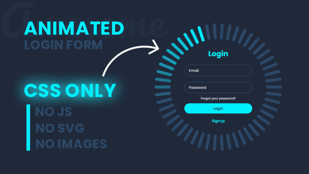
Hi! In this blog, we will learn how to make a creative animated login form in HTML and CSS Only.
Hi, let’s dive into the epic world of web design where the login form is not just a snooze fest. Imagine an animated login form that greets you with rad rotating glowing effects. This blog post is all about the look and vibes when you’re login, so get ready for some mind blowing animation magic.
The Coolness of Rotating Glows
Animated login form with rotating glowing effects are like a tech art masterpiece. They take a basic task and turn it into an epic experience. Picture this, when you see login form, it starts spinning gracefully and shines with a mesmerizing glow. This isn’t just about catching your eye, it’s about making you go, “This is awesome!”.
Seamless Entry to the Magic Zone
Going to the login form should feel like you are stepping into a whole new world. Rotating glowing effects can make that transition smooth and jaw dropping. Imagine when you see the login form like a dazzling carousel. This animation isn’t just visually stunning, it guides you into the login process like a VIP.
Color and Lights That Pop
Glowing effects are all about colors and lights that pop like a firework show. Think about your website vibe and theme. Soft, warm colors like gold, amber, or turquoise can set a welcoming and magical mood. You can blend these colors into the glowing animation, giving your login form depth and personality.
The Illusion of Depth
To take things to the next level, Imagine the login fields spinning around like a cosmic dance, creating a mind bending illusion of depth. This is not just about looking cool, it’s about immersing you in a trippy visual experience.
The Hovering Hype
Hover effects are like the icing on your rotating glowing cake. When you hover over the login button, it could pulse softly, like a heartbeat, showing it’s ready for action. These little cues make the whole experience even more exciting and interactive.
User Engagement – Keep Hooked
Getting users engaged is a big deal in web design. Rotating glowing effects are like a magnet that keeps users hooked and excited to interact with your login form. It’s not just about function, it’s about creating a connection that’s out of this world.
You Might Also Like This:
- 3D Portfolio Website – HTML CSS and Javascript
- Magic Navigation Menu Indicator using HTML CSS and Javascript
- What is a Website – Definition From Codehal
Video Tutorial:
How to Make a Creative Animated Login Form using HTML and CSS only.
Source Files – Animated Login Form
HTML Code:
<!DOCTYPE html>
<html lang="en">
<head>
    <meta charset="UTF-8">
    <meta http-equiv="X-UA-Compatible" content="IE=edge">
    <meta name="viewport" content="width=device-width, initial-scale=1.0">
    <title>Animated Login Form using HTML CSS Only | Codehal</title>
    <link rel="stylesheet" href="style.css">
</head>
<body>
    <div class="container">
        <div class="login-box">
            <h2>Login</h2>
            <form action="#">
                <div class="input-box">
                    <input type="email" required>
                    <label>Email</label>
                </div>
                <div class="input-box">
                    <input type="password" required>
                    <label>Password</label>
                </div>
                <div class="forgot-pass">
                    <a href="#">Forgot your password?</a>
                </div>
                <button type="submit" class="btn">Login</button>
                <div class="signup-link">
                    <a href="#">Signup</a>
                </div>
            </form>
        </div>
        <span style="--i:0;"></span>
        <span style="--i:1;"></span>
        <span style="--i:2;"></span>
        <span style="--i:3;"></span>
        <span style="--i:4;"></span>
        <span style="--i:5;"></span>
        <span style="--i:6;"></span>
        <span style="--i:7;"></span>
        <span style="--i:8;"></span>
        <span style="--i:9;"></span>
        <span style="--i:10;"></span>
        <span style="--i:11;"></span>
        <span style="--i:12;"></span>
        <span style="--i:13;"></span>
        <span style="--i:14;"></span>
        <span style="--i:15;"></span>
        <span style="--i:16;"></span>
        <span style="--i:17;"></span>
        <span style="--i:18;"></span>
        <span style="--i:19;"></span>
        <span style="--i:20;"></span>
        <span style="--i:21;"></span>
        <span style="--i:22;"></span>
        <span style="--i:23;"></span>
        <span style="--i:24;"></span>
        <span style="--i:25;"></span>
        <span style="--i:26;"></span>
        <span style="--i:27;"></span>
        <span style="--i:28;"></span>
        <span style="--i:29;"></span>
        <span style="--i:30;"></span>
        <span style="--i:31;"></span>
        <span style="--i:32;"></span>
        <span style="--i:33;"></span>
        <span style="--i:34;"></span>
        <span style="--i:35;"></span>
        <span style="--i:36;"></span>
        <span style="--i:37;"></span>
        <span style="--i:38;"></span>
        <span style="--i:39;"></span>
        <span style="--i:40;"></span>
        <span style="--i:41;"></span>
        <span style="--i:42;"></span>
        <span style="--i:43;"></span>
        <span style="--i:44;"></span>
        <span style="--i:45;"></span>
        <span style="--i:46;"></span>
        <span style="--i:47;"></span>
        <span style="--i:48;"></span>
        <span style="--i:49;"></span>
    </div>
</body>
</html>
CSS Code:
@import url('https://fonts.googleapis.com/css2?family=Poppins:wght@300;400;500;600;700;800;900&display=swap');
* {
    margin: 0;
    padding: 0;
    box-sizing: border-box;
    font-family: 'Poppins', sans-serif;
}
body {
    display: flex;
    justify-content: center;
    align-items: center;
    min-height: 100vh;
    background: #1f293a;
}
.container {
    position: relative;
    width: 256px;
    height: 256px;
    display: flex;
    justify-content: center;
    align-items: center;
}
.container span {
    position: absolute;
    left: 0;
    width: 32px;
    height: 6px;
    background: #2c4766;
    border-radius: 8px;
    transform-origin: 128px;
    transform: scale(2.2) rotate(calc(var(--i) * (360deg / 50)));
    animation: animateBlink 3s linear infinite;
    animation-delay: calc(var(--i) * (3s / 50));
}
@keyframes animateBlink {
    0% {
        background: #0ef;
    }
    25% {
        background: #2c4766;
    }
}
.login-box {
    position: absolute;
    width: 400px;
}
.login-box form {
    width: 100%;
    padding: 0 50px;
}
h2 {
    font-size: 2em;
    color: #0ef;
    text-align: center;
}
.input-box {
    position: relative;
    margin: 25px 0;
}
.input-box input {
    width: 100%;
    height: 50px;
    background: transparent;
    border: 2px solid #2c4766;
    outline: none;
    border-radius: 40px;
    font-size: 1em;
    color: #fff;
    padding: 0 20px;
    transition: .5s ease;
}
.input-box input:focus,
.input-box input:valid {
    border-color: #0ef;
}
.input-box label {
    position: absolute;
    top: 50%;
    left: 20px;
    transform: translateY(-50%);
    font-size: 1em;
    color: #fff;
    pointer-events: none;
    transition: .5s ease;
}
.input-box input:focus~label,
.input-box input:valid~label {
    top: 1px;
    font-size: .8em;
    background: #1f293a;
    padding: 0 6px;
    color: #0ef;
}
.forgot-pass {
    margin: -15px 0 10px;
    text-align: center;
}
.forgot-pass a {
    font-size: .85em;
    color: #fff;
    text-decoration: none;
}
.forgot-pass a:hover {
    text-decoration: underline;
}
.btn {
    width: 100%;
    height: 45px;
    background: #0ef;
    border: none;
    outline: none;
    border-radius: 40px;
    cursor: pointer;
    font-size: 1em;
    color: #1f293a;
    font-weight: 600;
}
.signup-link {
    margin: 20px 0 10px;
    text-align: center;
}
.signup-link a {
    font-size: 1em;
    color: #0ef;
    text-decoration: none;
    font-weight: 600;
}
.signup-link a:hover {
    text-decoration: underline;
}
Conclusion
When it comes to web design, looks matter, and creating an extraordinary user experience is the name of the game. Animated login form with rotating glowing effects are more than just fancy visuals, they’re a gateway to a world of magic. By picking the right colors, adding depth, and wowing users with hover effects, you can make login an adventure. These effects capture users, transport them into a world of wonder, and make them feel connected to your website. So, dive into the world of glowing rotations, and watch as your users embark on an unforgettable journey filled with awe and excitement! Happy Coding!