Hello coders! In this blog, we will learn how to make modal popup in HTML CSS and Javascript.
In the wild world of web stuff and apps, you’ve probably come across those little popup thingies, right? They’re like mini windows that show up on your screen. These popups have a ton of different jobs, from telling you stuff and asking for your info to making website more interesting. In this blog, we’re gonna break it down, what’s a modal popup, how it does its thing, and why it matters.
Video Tutorial:
Watch the video in this blog about how to make modal popup in HTML CSS and javascript.
What’s the Deal with Modal Popups?
A modal popup is like this window that suddenly shows up on a webpage. The word “modal” means that it puts you in a special mode where you gotta deal with the popup before you can go back to what you were doing.
These popups are pretty handy for:
Telling You Things: Sometimes, they pop up to give you info, like notifications or messages.
Getting Your Input: You might see a popup that wants you to type stuff, signup for things, or buy stuff.
Making Sure You’re Sure: You know when a site asks “Are you really sure you wanna delete this?” That’s a modal popup.
Show Stuff Related to What You’re Doing: They can show you more details about a picture or video when you click on something.
How Do Modal Popups Work?
Modal popups work in a pretty basic way. When something triggers them, they appear on top or center of the main stuff on the webpage. It’s kinda like they dim the lights in the background to make the popup shine. Here’s how they roll:
User Starts It: You’re usually the one who makes a modal popup appear. You click on something, and boom, the popup shows up.
Dimmed Background: The main stuff in the background gets a little darker or blurry to make the popup stand out.
Popup Shows Up: The popup comes up right in the middle of your screen. It’s all about the message it wants to give or the thing it wants you to do.
Special Mode: Modal popup are called “modal” because they make you do stuff before you can go back to what you were doing. You gotta deal with the popup first.
User Does Things: In the popup, you can do stuff like typing in info, reading a message, or saying “yes” or “no.” Sometimes, there’s a button to close it if you change your mind.
Getting Out: If you wanna get rid of the popup, you can usually click outside of it or hit the “Escape” key. Some popups also have a button to close them.
How Modal Popup Change Your Web Experience
Modal popup have a big impact on how you do stuff on the web, and whether they’re a good or bad thing depends on how they’re used. Here’s what you need to know:
They Get Your Attention: Modal popups are designed to grab your attention. When they’re used the right way, they can tell you important stuff or make you do something important.
You Focus on the Popup: They make you look at the popup first before you can go back to whatever you were doing. That’s cool for stuff that needs your full attention.
No Jumping Around: They stop you from going to different pages or screens. This can be nice because you don’t have to figure out where you were before.
Can Be Annoying: But if websites use them too much or at the wrong times, they can be really annoying. You might feel like they’re always popping up in your face and messing up your flow.
How to Use Modal Popups Like a Pro
If you’re thinking about using modal popups, you should use them right. Here’s how to do it like a champ:
Keep It Relevant: Only use them when it really makes sense. Make sure what you’re showing or asking is related to what the user is doing.
Timing Matters: Don’t make them show up right when someone lands on your site. Be cool about it, use triggers that make sense, like when someone is about to leave your site or after they’ve been there for a bit.
Explain Clearly: Tell people what your popup is all about and what you want them to do. Keep it simple, don’t use confusing words.
Easy to Close: Make it super easy to close the popup. Put a clear button or let people tap outside to close it.
Accessibility Matters: Make sure everyone can use your popups.
You might also like this:
Source Files – Modal Popup HTML CSS
HTML Code:
<!DOCTYPE html>
<html lang="en">
<head>
<meta charset="UTF-8">
<meta http-equiv="X-UA-Compatible" content="IE=edge">
<meta name="viewport" content="width=device-width, initial-scale=1.0">
<title>Modal Popup in HTML CSS Javascript | Codehal</title>
<link rel="stylesheet" href="style.css">
</head>
<body>
<button class="show-popup">Show Popup</button>
<div class="popup-container">
<div class="popup-box">
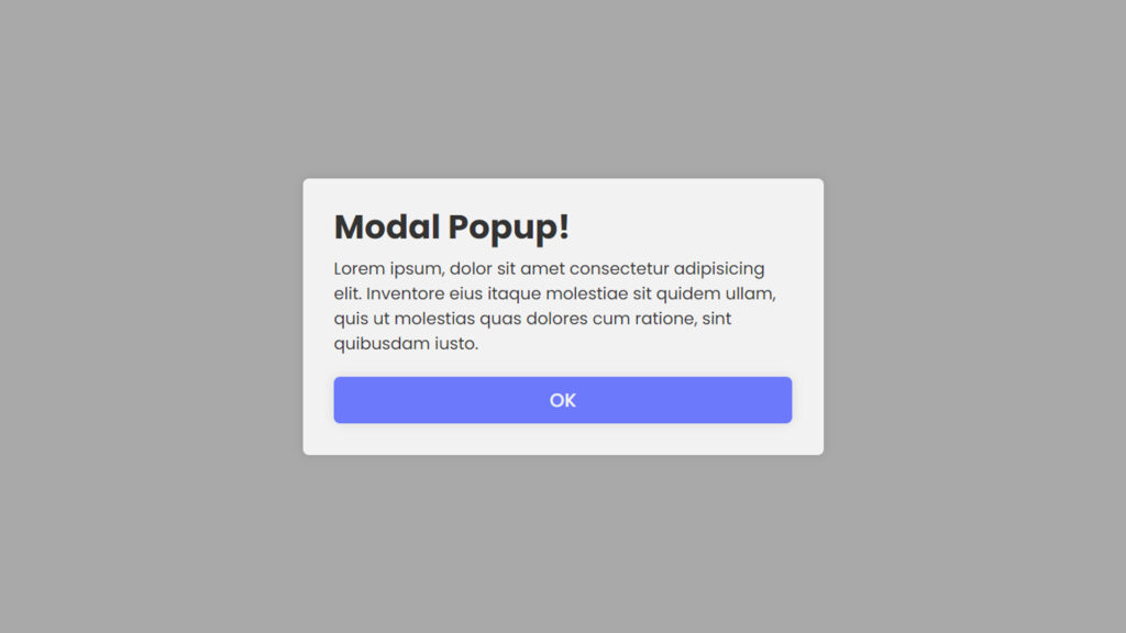
<h1>Hello World!</h1>
<p>Lorem ipsum, dolor sit amet consectetur adipisicing elit. Inventore eius itaque molestiae sit quidem ullam, quis ut molestias quas dolores cum ratione, sint quibusdam iusto.</p>
<button class="close-btn">OK</button>
</div>
</div>
<script src="script.js"></script>
</body>
</html>CSS Code:
@import url("https://fonts.googleapis.com/css2?family=Poppins:wght@300;400;500;600;700;800;900&display=swap");
* {
  margin: 0;
  padding: 0;
  box-sizing: border-box;
  font-family: "Poppins", sans-serif;
}
body {
  display: flex;
  justify-content: center;
  align-items: center;
  min-height: 100vh;
  background: #f2f2f2;
}
.show-popup {
  padding: 18px 40px;
  background: #6e78ff;
  border: none;
  outline: none;
  border-radius: 6px;
  box-shadow: 0 0 10px rgba(0, 0, 0, .1);
  cursor: pointer;
  font-size: 18px;
  color: #f2f2f2;
  font-weight: 500;
}
.popup-container {
  position: absolute;
  width: 100%;
  height: 100%;
  background: rgba(0, 0, 0, .3);
  display: flex;
  justify-content: center;
  align-items: center;
  opacity: 0;
  pointer-events: none;
}
.popup-container.active {
  opacity: 1;
  pointer-events: auto;
  transition: .4s ease;
}
.popup-container .popup-box {
  width: 500px;
  background: #f2f2f2;
  border-radius: 6px;
  box-shadow: 0 0 10px rgba(0, 0, 0, .1);
  padding: 30px;
  transform: scale(0);
}
.popup-container.active .popup-box {
  transform: scale(1);
  transition: .4s ease;
  transition-delay: .25s;
}
.popup-box h1 {
  color: #333;
  line-height: 1;
}
.popup-box p {
  color: #333;
  margin: 12px 0 20px;
}
.popup-box .close-btn {
  width: 100%;
  height: 45px;
  background: #6e78ff;
  border-radius: 6px;
  border: none;
  outline: none;
  box-shadow: 0 0 10px rgba(0, 0, 0, .1);
  cursor: pointer;
  font-size: 18px;
  color: #f2f2f2;
  font-weight: 500;
}
JavaScript Code:
const showPopup = document.querySelector('.show-popup');
const popupContainer = document.querySelector('.popup-container');
const closeBtn = document.querySelector('.close-btn');
showPopup.onclick = () => {
    popupContainer.classList.add('active');
}
closeBtn.onclick = () => {
    popupContainer.classList.remove('active');
}
Conclusion
Modal popups are like these little windows that pop up on websites. They can be super helpful or super annoying, depending on how they’re used. When done right, they can make your web experience better by giving you the info you need or making things easier. But when overused, they can feel like they’re just in your face all the time. So, use them wisely, and make sure they’re a great addition to your web game.