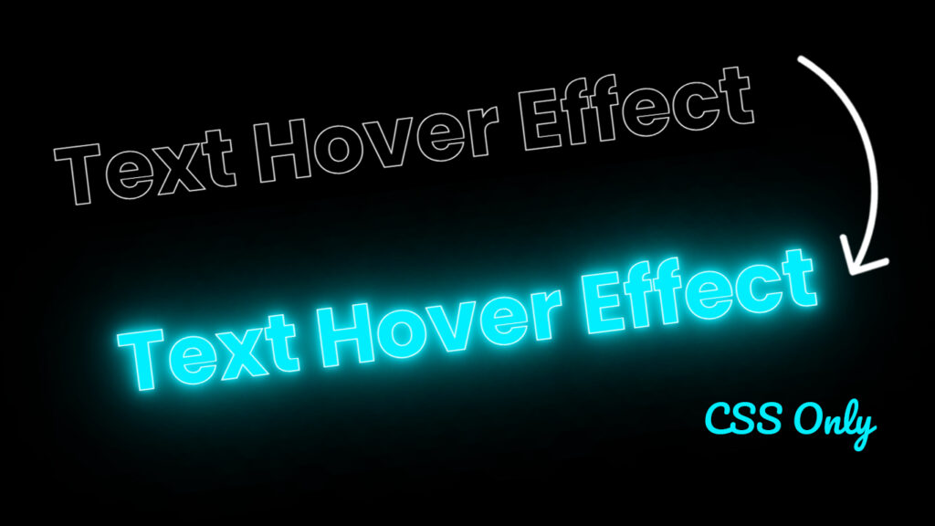
Hello everyone! In this blog, we will learn how to make animated text on hover effects animation in HTML CSS.
Let’s talk about those sick animated text hover effects that make your website pop! Animated text hover effects are like the cool magic tricks of web design. They make the text on your site go crazy when you hover your mouse over it, and it’s just awesome. In this blog post, we’re gonna break down what animated text hover effects are, how they work, and why they’re so freakin cool for your website.
Decoding Animated Text Hover Effects
Animated text hover effects are basically web design tricks that make your text do the electric slide when you hover your mouse over it. You can make it change colors, get bigger or smaller, do a little dance, or even switch up the background. The whole point is to make your website look rad and make people wanna hang out on it longer.
Video Tutorial:
CSS Text Hover Animation Effects.
Essential Elements of Animated Text Hover Effects
Color Swaps: Changing text colors is a classic move. When you hover, it can turn into any color or even a rainbow. It’s like a chameleon for your website.
Size Shakeup: You can make your text grow or shrink when someone hovers over it. It’s like a text that’s been hitting the gym, flexing its fonts.
Text Boogie: You can make your text move, like making it bounce, twirl, or slide in from the side. It’s like a text that’s got some fancy footwork.
Background Bling: You can also change the background color or add a cool picture behind your text when someone hovers. It’s like giving your text a party backdrop.
Text Tattoos: You can add or remove stuff like underlines, strikethroughs, or outlines to make your text look extra fly.
How Animated Text Hover Effects Get Down
Making text hover animation happen is like a secret handshake between HTML, CSS, and sometimes a bit of JavaScript. Here’s the lowdown on how it all goes down:
HTML: You start by picking the text you want to jazz up in your HTML. You might use a <h1> to <h6>, <p>, <div> or <span> to wrap it up.
CSS: The real magic comes from the CSS. You make a set of rules that say how your text should behave, like what color it should be and how big it is. You can use CSS properties like color, font-size, transform, and background to make the magic happen.
Hover Magic: You use the :hover trick to say, “Hey, when someone hovers over this text, here’s what you should do.” This is where the fun stuff really kicks in.
Transition Vibes: You can even add transition properties to control how long the animation takes and how smooth it looks. This makes your text change colors or do a dance more smoothly.
Why Animated Text Hover Effects Are the Bomb
Keepin It Engaging: These effects grab your attention, making you want to click and explore. They’re like your friend showing you a cool trick, you just gotta check it out.
A Better Time: They make the whole website experience more fun. They let you know that something’s interactive and clickable. It’s like putting a smiley face sticker on a button.
Eye Candy: These effects make your site look cooler. They add style and personality, like putting on your favorite outfit.
Button Boost: You can use them to highlight important stuff, like buttons or links. It’s like making a “Buy Now” button wink at you.
Stay and Play: People hang around longer on websites with fun stuff to do. These effects are like handing out free samples, people wanna stick around for more.
Pro Tips for Dropping Animated Text Hover Effects
Chill Out: Less is often more. Don’t go crazy with too many effects, keep it chill and balanced.
Stay in the Groove: Make sure your effects match the overall vibe of your site. You don’t want to wear a Hawaiian shirt to a formal event, right?.
Speed Check: Be careful not to slow down your site with heavy animations. Keep it smooth and snappy.
Source Files – Animated Text on Hover Effects:
HTML Code:
<!DOCTYPE html>
<html lang="en">
<head>
    <meta charset="UTF-8">
    <meta http-equiv="X-UA-Compatible" content="IE=edge">
    <meta name="viewport" content="width=device-width, initial-scale=1.0">
    <title>Animated Text Hover Effect | Codehal</title>
    <link rel="stylesheet" href="style.css">
</head>
<body>
    <h1>Hover Me</h1>
</body>
</html>
CSS Code:
@import url("https://fonts.googleapis.com/css2?family=Poppins:wght@300;400;500;600;700;800;900&display=swap");
* {
  margin: 0;
  padding: 0;
  font-family: "Poppins", sans-serif;
}
body {
  display: flex;
  justify-content: center;
  align-items: center;
  min-height: 100vh;
  background: #000;
}
h1 {
  color: transparent;
  -webkit-text-stroke: 1px #fff;
  font-size: 120px;
  background-image: linear-gradient(#0ef, #0ef);
  background-repeat: no-repeat;
  -webkit-background-clip: text;
  background-position: -600px 0;
  transition: background-position 1s, text-shadow 1s;
  transition-delay: 0.6s, 0s;
}
h1:hover {
  transition: background-position 1s, text-shadow 1s;
  transition-delay: 0s, 1s;
  background-position: 0 0;
  text-shadow: 0 0 10px #0ef, 0 0 20px #0ef, 0 0 40px #0ef, 0 0 80px #0ef,
    0 0 160px #0ef;
}
Conclusion
Text hover effects animation are like the cool sunglasses that make your website look awesome. They make your site more fun, interactive, and stylish. By understanding how they work and using them wisely, you can hook people in, keep them around, and make your website feel like a real party. Just remember, it’s all about balance and making your website visitors feel like they’re having a blast. So go ahead, add some sparkle to your website, and let it shine!