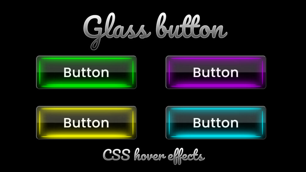
Hello everyone! In this blog, we will learn how to create glassmorphism button on hover effects in HTML and CSS.
In the ever evolving world of web design, user interface elements have seen a dramatic transformation over the years. Among these elements, buttons hold a special place in the heart of designers and developers. Buttons serve as essential components for user interaction, navigation, and engagement. They come in various shapes, sizes, and styles, and one of the most captivating styles that have gained popularity is the “glassmorphism button hover effect.”
Glassmorphism button hover effects add a touch of elegance and sophistication to websites. These effects create a mesmerizing experience when a user hovers their cursor over a button, revealing a glassy, transparent, and interactive interface. In this blog post, we’ll delve into the world of glass button hover effects, exploring what they are, how they work, and how you can implement them to enhance your website’s aesthetics and user experience.
Video Tutorial:
What’s the Deal with Glass Button Hover Effects?
So, glass button hover effects are like a design trick. They make buttons look all fancy, like glass, when you hover your mouse over them. It’s like magic! The cool stuff about these effects is:
See Through Action: Glass buttons are clear, which means you can kinda see what’s behind them. It’s like they’re floating on your screen or something.
Hover Magic: These effects kick in when you move your cursor over the button. It goes from normal to a passing glass effect sparkle in a blink, and that’s what makes it rad.
Shadows and Lighting: There’s also this shadow and lighting thing going on. It makes the button look 3D and gives it that glassy vibe.
Color Bling: The colors can change, mix, and blend when you hover. It’s like they’re alive, man!
Smooth Moves: It’s all about making those transitions super smooth and easy on the eyes. No jagged moves, just cool transitions.
The Science Behind Glass Button Hover Effects
Creating a convincing glass button hover effect involves a combination of CSS to control the interaction and animation. Let’s break down the key components of a glass button hover effect:
Set Up Your Button: Start by putting together your button in HTML. You know, a <button> or <a> with your text or whatever inside.
Style It Up: Use CSS to make your button look cool by setting properties like background-color, border, and border-radius. Make it look snazzy!
Get Creative with Layers: Add pseudo element in CSS to create the glass effect. These are like extra layers that will change when you hover over the button.
Hover Power: Define the hover state in CSS. This is where you say, “Hey, when someone hover over my button, it’s gonna look like this!” Tweak stuff like transparency, background color, and more.
Smooth Transitions: Use CSS transitions or animations to make that change from regular to glassy super smooth. It’s all about the transition.
Source Files – Glassmorphism Button Hover Effects:
HTML Code:
<!DOCTYPE html>
<html lang="en">
<head>
    <meta charset="UTF-8">
    <meta http-equiv="X-UA-Compatible" content="IE=edge">
    <meta name="viewport" content="width=device-width, initial-scale=1.0">
    <title>Glass Button Hover Effects | Codehal</title>
    <link rel="stylesheet" href="style.css">
</head>
<body>
    <button>Button
        <span></span>
        <span></span>
    </button>
</body>
</html>
CSS Code:
@import url('https://fonts.googleapis.com/css2?family=Poppins:wght@500&display=swap');
* {
    margin: 0;
    padding: 0;
    font-family: 'Poppins', sans-serif;
}
body {
    display: flex;
    justify-content: center;
    align-items: center;
    min-height: 100vh;
    background: #000;
}
button {
    position: relative;
    width: 300px;
    height: 100px;
    background: transparent;
    border: 2px solid rgba(255, 255, 255, .5);
    border-right: 2px solid rgba(255, 255, 255, .2);
    border-bottom: 2px solid rgba(255, 255, 255, .2);
    border-radius: 10px;
    color: #fff;
    font-size: 40px;
    letter-spacing: 1px;
    cursor: pointer;
    overflow: hidden;
}
button::before {
    content: '';
    position: absolute;
    top: 0;
    left: 0;
    width: 100%;
    height: 50%;
    background: rgba(255, 255, 255, .2);
}
button::after {
    content: '';
    position: absolute;
    top: 0;
    left: -100%;
    width: 100%;
    height: 100%;
    background: linear-gradient(90deg, transparent, rgba(255, 255, 255, .4), transparent);
    transition: .5s;
}
button:hover::after {
    left: 100%;
}
span {
    position: absolute;
    bottom: 5px;
    left: 50%;
    transform: translateX(-50%);
    width: 270px;
    height: 3px;
    background: #0ef;
    border-radius: 2000px / 50px;
    box-shadow:
        0 0 10px #0ef,
        0 0 20px #0ef,
        0 0 20px #0ef,
        0 0 20px #0ef,
        0 0 40px #0ef,
        0 0 80px #0ef,
        0 0 160px #0ef;
}
span::before {
    content: '';
    position: absolute;
    bottom: 4px;
    left: 50%;
    transform: translateX(-50%);
    width: 240px;
    height: 3px;
    background: #0ef;
    border-radius: 2000px / 50px;
    box-shadow:
        0 0 10px #0ef,
        0 0 20px #0ef,
        0 0 20px #0ef,
        0 0 20px #0ef,
        0 0 40px #0ef,
        0 0 80px #0ef,
        0 0 160px #0ef;
}
span::after {
    content: '';
    position: absolute;
    bottom: 83px;
    left: 50%;
    transform: translateX(-50%);
    width: 270px;
    height: 3px;
    background: #0ef;
    border-radius: 2000px / 50px;
    box-shadow:
        0 0 10px #0ef,
        0 0 20px #0ef,
        0 0 20px #0ef,
        0 0 20px #0ef,
        0 0 40px #0ef,
        0 0 80px #0ef,
        0 0 160px #0ef;
}
span:nth-child(2) {
    position: absolute;
    top: 50%;
    left: 8px;
    transform: translateY(-50%);
    width: 3px;
    height: 70px;
    border-radius: 70px / 2000px;
}
span:nth-child(2)::before {
    content: '';
    position: absolute;
    top: 50%;
    left: 277px;
    transform: translateY(-50%);
    width: 2.5px;
    height: 70px;
    border-radius: 70px / 2000px;
}
span:nth-child(2)::after {
    display: none;
}
Conclusion
Glass button hover effects are like a secret weapon in the world of web design. They make your buttons look extra fancy and give your users a memorable experience.. With a little HTML, CSS, you can make your website shine and keep your visitors coming back for more. Try different styles, mix and match, and have fun with it. Your website is your canvas, and these glass button hovers are your brush. Make it art!