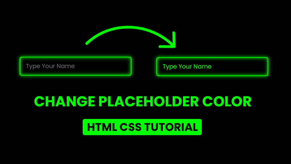
Hello everyone! In this blog, we will learn how to change placeholder color in HTML and CSS.
Web forms rely on placeholder text to guide users in providing information. The ability to customize the color of these placeholders is a fundamental aspect of web design. In this blog post, we’ll delve into the art of altering placeholder text colors in HTML and CSS. You’ll gain valuable insights and practical methods to create web forms that not only function seamlessly but also seamlessly align with your site’s aesthetics.
Video Tutorial Of Change Placeholder Color HTML CSS
The Purpose of Placeholder Text
Placeholder text is concise hints or examples placed within input fields, text areas, and various form elements. It serves the primary function of instructing users on what data to input. For instance, a login form typically includes placeholders like “Username” or “Email,” prompting users to enter their credentials. As users engage with the field, the placeholder text vanishes.
HTML and Placeholder Attributes
In HTML, the “placeholder” attribute is used to implement placeholders within form elements. Here’s a simple example:
<input type="text" placeholder="Enter Your Name">In this code, the “placeholder” attribute is set as “Enter your name,” which displays within the input field until users commence input.
The default text color of placeholders varies among user agents (e.g., web browsers), making customization a necessity to maintain design consistency. The solution lies in CSS.
Altering Placeholder Text Color with CSS
Customizing placeholder text color in HTML forms is a breeze with CSS. To achieve this, you’ll typically work with the “::placeholder” pseudo-element.
Here’s how to change the placeholder text color to a tasteful gray:
::placeholder {
  color: #777;
}
In this code, the “::placeholder” pseudo-element specifically targets and styles placeholder text. The “color” property sets the text color to a shade of gray (#777).
It’s crucial to note that not all browsers support the “::placeholder” pseudo-element. To ensure compatibility, it’s wise to employ the “-webkit-input-placeholder” and “-moz-placeholder” pseudo-elements for WebKit-based and Mozilla-based browsers, respectively:
::placeholder,
:-ms-input-placeholder,
::-ms-input-placeholder,
:-moz-placeholder {
  color: #777;
}
This code is designed to accommodate a broader spectrum of browsers, ensuring consistent behavior.
Customizing Placeholder Text Color for Specific Input Fields
For tailored design, you can personalize the placeholder text color for particular input fields by using IDs, classes, or other CSS selectors. Let’s say you have an input field with the ID “username.” To change the placeholder text color for this field, employ the following CSS code:
#username::placeholder {
  color: #0ef;
}
In this scenario, the “#username::placeholder” selector narrows down the customization to just the placeholder text in the “username” input field.
Combining Placeholder Styling with Other CSS Properties
Customizing placeholder text color is just one facet of form element styling. To create a coherent design, you can marry placeholder styling with other CSS properties. Adjusting font size, font family, padding, and border properties is an excellent way to improve the visual appeal and usability of your form elements.
Consider this example where the placeholder text color, font size, and padding are adjusted:
::placeholder {
  color: #444;
  font-size: 16px;
  padding: 8px;
}
This approach lets you create diverse styles for different input fields and form elements by utilizing specific selectors.
Prioritizing Accessibility
While enhancing the aesthetics of web forms through placeholder text color customization is enticing, it’s paramount to uphold accessibility. Some users have visual impairments or rely on assistive technologies, making readability and contrast essential considerations.
Okay,, If you want to try the placeholder project in this post, you can copy the code below.
Source Files – Change Placeholder Color HTML CSS
HTML Code
<!DOCTYPE html>
<html lang="en">

<head>
    <meta charset="UTF-8">
    <meta http-equiv="X-UA-Compatible" content="IE=edge">
    <meta name="viewport" content="width=device-width, initial-scale=1.0">
    <title>Change Placeholder Color HTML CSS | Codehal</title>
    <link rel="stylesheet" href="style.css">
</head>

<body>

    <input type="text" placeholder="Type Your Name">

</body>

</html>
CSS Code
@import url('https://fonts.googleapis.com/css2?family=Poppins:wght@300;400;500;600;700;800;900&display=swap');

* {
    margin: 0;
    padding: 0;
    box-sizing: border-box;
    font-family: 'Poppins', sans-serif;
}

body {
    display: flex;
    justify-content: center;
    align-items: center;
    min-height: 100vh;
    background: #000;
}

input {
    width: 300px;
    height: 50px;
    background: transparent;
    outline: none;
    border: 2px solid #0f0;
    border-radius: 5px;
    padding: 0 15px;
    box-shadow: 0 0 10px #0f0, inset 0 0 10px #0f0;
    color: #0f0;
    font-size: 16px;
}

input::placeholder {
    color: #0f0;
}
Conclusion
Changing placeholder text color in HTML and CSS is a simple yet powerful way to tailor your web forms to match your site’s design. By utilizing the “::placeholder” pseudo-element, you can seamlessly target and style placeholder text. To ensure an inclusive user experience, maintain readability and contrast, and always aim for a harmonious design that marries aesthetics with functionality. With the knowledge and techniques presented in this blog post, you can create web forms that are both aesthetically pleasing and highly functional.