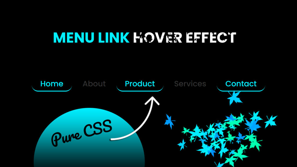
Hey everyone!, In this blog, we will learn how to make beautiful animated navigation bar in HTML and CSS.
Yopps, web design is all about looking fly and keeping the user hyped up. All these web elements, including menu links, are key to making a website look lit. Among all the cool design tricks, the “menu link on hover effect” is where it’s at. In this blog post, let’s check out what a stunning menu link does when you hover over it and how to make one that’ll totally rock your site.
Know the Basics ??
Before we jump into the groove of making some awesome hover effects, it’s important to get the lowdown on what they are and why they’re a big deal.
What’s a Hover Effect?
Hover effects are like those cool transformations that happen when you slide your mouse over stuff on a webpage. For menu links, it means that when you hover over one, it’s gonna change in some cool way. This change can be something small, like a color switch, or something way out, like some sweet animated action.
Why Do Hover Effects Matter?
Hover effects aren’t just for show, they are super important for web design:
- Feedback: They give users a heads up that something is clickable. That’s a smart way to make things easier to figure out.
- Engagement: Hover effects make your site more exciting, so users are more likely to hang around and check things out.
- Aesthetics: Well done hover effects make your site look awesome. That’s what everyone wants, right??.
Now, let’s roll up our sleeves and figure out what makes a menu link on hover so epic.
The Recipe for a Dope Hover Effect
Creating a cool menu link on hover effect is all about mixing design skills with tech magic. Here are the ingredients:
1. Smooth Moves
Cool hover effects usually have some sweet animations. This could be as simple as a smooth color change or something more complex with things fading in and out. The key is to make the change look slick and not in your face.
2. Color Harmony
Picking the right colors for your hover effect is key. You want them to match the overall vibe of your site, so it all looks super fresh.
3. Smooth Transitions Only
Nobody likes a jarring change. The hover effect should be buttery smooth, so it’s easy on the eyes.
4. Readability and Easy Peasy Navigation
Your hover effect should make the menu links easier to read and use. That’s the whole point, after all. Plus, it should work for everyone, so make sure it’s accessible.
5. User-Friendly, All the Way
Remember, the hover effect should make the user’s experience better. It’s gotta be intuitive and easy to use, so folks can get where they want without any hassle…
Video Tutorial:
You can also watch a video tutorial on this blog, “Animated Navigation Bar in HTML and CSS – Menu Hover Animation Effects” in the video below.
Source Files – Menu Link Hover Effects
HTML Code:
<!DOCTYPE html>
<html lang="en">
<head>
    <meta charset="UTF-8">
    <meta http-equiv="X-UA-Compatible" content="IE=edge">
    <meta name="viewport" content="width=device-width, initial-scale=1.0">
    <title>Navigation Menu Bar Hover Effect | Codehal</title>
    <link rel="stylesheet" href="style.css">
</head>
<body>
    <nav>
        <a href="#">Home<span></span></a>
        <a href="#">About<span></span></a>
        <a href="#">Services<span></span></a>
        <a href="#">Contact<span></span></a>
    </nav>
</body>
</html>
CSS Code:
@import url('https://fonts.googleapis.com/css2?family=Poppins:wght@500&display=swap');
* {
    margin: 0;
    padding: 0;
    box-sizing: border-box;
    font-family: 'Poppins', sans-serif;
}
body {
    display: flex;
    justify-content: center;
    align-items: center;
    min-height: 100vh;
    background: #000;
}
nav a {
    position: relative;
    font-size: 1.1em;
    color: #333;
    text-decoration: none;
    padding: 6px 20px;
    transition: .5s;
}
nav a:hover {
    color: #0ef;
}
nav a span {
    position: absolute;
    top: 0;
    left: 0;
    width: 100%;
    height: 100%;
    z-index: -1;
    border-bottom: 2px solid #0ef;
    border-radius: 15px;
    transform: scale(0) translateY(50px);
    opacity: 0;
    transition: .5s;
}
nav a:hover span {
    transform: scale(1) translateY(0);
    opacity: 1;
}
Conclusion
Cool menu link hover effects are like a secret sauce for web design. They make your site look hot, keep folks engaged, and help everyone find their way around. It’s all about keeping it smooth and looking super fresh.
Remember, the beauty of a hover effect is in its simplicity and how well it fits into your site’s style. It should make your site even more awesome, not steal the show. So, get experimenting and find the perfect mix of looks and function that wows your users and takes your web game to the next level. Don’t hold back,, explore the art of hover effects and level up your web projects!!!

