Hello everyone! In this blog, we will learn how to make a website with login and register using HTML CSS and Javascript.
Website with login and register features are the way to go if you want to make your online presence pop. They personalize your experience, keep things safe and sound, and let you be part of the action. If you’re ready to create a website that’s more than just a digital billboard, think about adding login and registration features. You’ll build a place where users feel at home, and that’s where the real online magic happens.
Let’s talk about something that takes websites to the next level, those smooth moves from the login page to the sign up page. We’re diving into the visuals and animations that make this transition ultra cool, and how it totally rocks the user experience right from the start.
Video Tutorial of Website with Login and Registration
You can watch a video tutorial in the below “How To Make A Website With Login And Register using HTML CSS and Javascript”. You can check out this video.
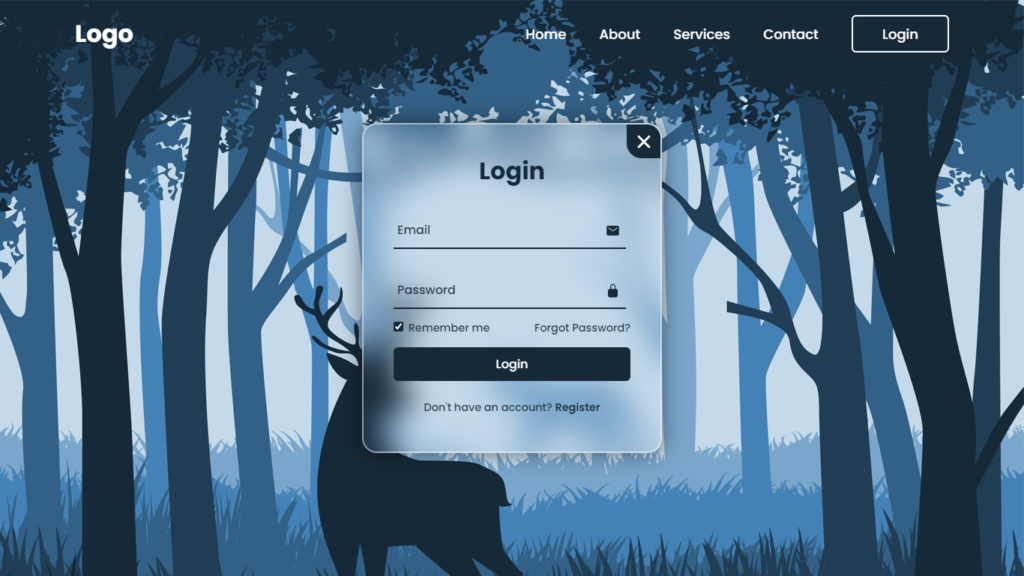
The Look of Login to Register Transitions
Imagine this, You hit a website, and you’re greeted by a sleek, chill login page. It’s clean, not too busy, and gives off this vibe of simplicity and style. You punch in your details and hit “Login.” Then, boom! Instead of abruptly shoving you to a separate registration page, the login form transforms into a registration form with slick animations and eye catching moves.
Here’s what’s cooking in the world of these transitions:
1. Design Harmony
The login and register forms follow the same design rules. They have a consistent color palette, font style, and layout, making it look like they’re two sides of the same cool coin.
2. Smooth Animations
When you hit “Register” subtle animations kick in. Elements gracefully glide, fade, or transform to reveal the register form, making it a seamless visual journey.
3. Visual Flow
The transition keeps the same visual vibe, so it feels like you’re uncovering different layers of the same webpage instead of bouncing around different parts of the site.
4. User Friendly Flow
Users get it instantly. They see their login stuff, and as they switch to registration, it feels like a natural progression.
Why Go for Seamless Transitions?
You might be wondering, why even bother with these slick transitions? Well, here’s why they’re the bee’s knees:
- User Engagement: These transitions are like a magnet for your eyes. They keep you glued to the screen, tempting you to dive in and maybe even create an account. So, more interaction, more fun.
- Less Hassle: Old school transitions between login and register pages can be a buzzkill. Seamless transitions make it a breeze and keep the user vibe chill.
- Higher Conversion Rates: When it’s all smooth and seamless, users are more likely to complete the registration process. That means more people joining your club.
- Visual Awesomeness: Let’s face it, it looks cool! A website that pulls off these transitions stands out and leaves an impression that sticks.
- No Back and Forth: Users don’t have to jump back and forth between pages. It’s like a continuous flow that’s super easy to follow.
Crafting the Perfect Transition
Creating a seamless journey from login to register is an art, and it’s all about the details. Here’s how you make it happen:
- Consistent Design: Start with a design that matches for both forms. Use the same colors, fonts, and style, they are like the matching outfits of your website.
- Element Evolution: Elements should transform naturally as you switch from login to registration. Think expanding or contracting fields and buttons that change shape or text.
- Animations Are Key: CSS transitions and animations are your best pals here. They bring the magic, whether it’s a smooth fade in, a slick slide out, or a cool scale transformation.
- Keep Users in the Loop: Make sure users know what’s happening as they interact with the forms. Highlight the input fields, show error messages, and throw in some tooltips for guidance.
- Mobile Ready: Remember that not everyone is browsing on a big screen. Make sure your transition looks just as awesome on phones and tablets.
- Testing: Try it all out on different devices and browsers. You want it to be smooth for everyone.
- Performance Matters: As much as animations are cool, they shouldn’t slow down your website. Optimize them for speed and efficiency.
You Might Also Like This:
- How To Create A Website With Login And Register – HTML CSS & Javascript
- Animated Login Form in HTML and CSS Only
- Animated Login and Registration Form in HTML CSS & Javascript
Source Files – Starting Points
HTML Code – Starting Point:
<!DOCTYPE html>
<html lang="en">
<head>
    <meta charset="UTF-8">
    <meta http-equiv="X-UA-Compatible" content="IE=edge">
    <meta name="viewport" content="width=device-width, initial-scale=1.0">
    <title>Website With Login & Registration | Codehal</title>
    <link rel="stylesheet" href="style.css">
</head>
<body>
    <script src="script.js"></script>
    <script type="module" src="https://unpkg.com/ionicons@5.5.2/dist/ionicons/ionicons.esm.js"></script>
    <script nomodule src="https://unpkg.com/ionicons@5.5.2/dist/ionicons/ionicons.js"></script>
</body>
</html>
CSS Code – Starting Point:
@import url('https://fonts.googleapis.com/css2?family=Poppins:wght@300;400;500;600;700;800;900&display=swap');
* {
    margin: 0;
    padding: 0;
    box-sizing: border-box;
    font-family: 'Poppins', sans-serif;
}
body {
    display: flex;
    justify-content: center;
    align-items: center;
    min-height: 100vh;
    background: url('background.jpg') no-repeat;
    background-size: cover;
    background-position: center;
}
JavaScript Code – Starting Point:
const wrapper = document.querySelector('.wrapper');
const loginLink = document.querySelector('.login-link');
const registerLink = document.querySelector('.register-link');
const btnPopup = document.querySelector('.btnLogin-popup');
const iconClose = document.querySelector('.icon-close');
Conclusion
The visual wizardry of seamless transitions from login to registration forms on websites adds a touch of class and leaves a memorable mark on the user experience. These transitions create a sense of flow, reduce frustration, and engage users in a captivating way. When executed with style and an eye for design consistency, they elevate the aesthetics of a website and contribute to higher conversion rates and user satisfaction. So, if you’re looking to make a lasting impression on your website visitors, consider incorporating these seamless transitions and watch your user engagement skyrocket.
Buy This Project Complete Source Code From Here:
Buy This Project Complete Source Code From Here (By Paypal):