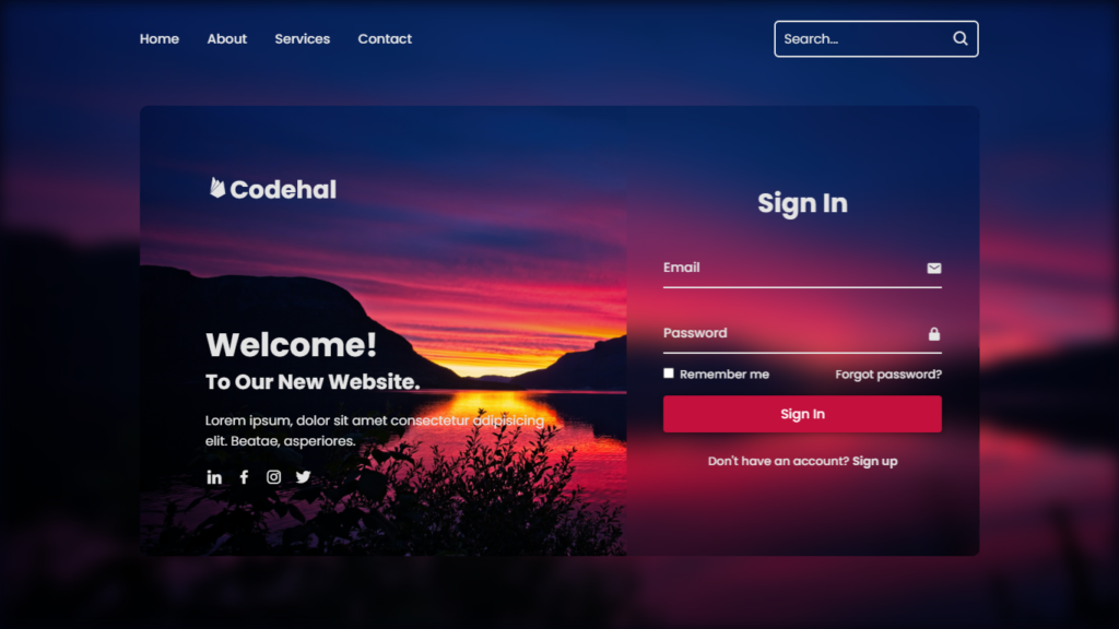
Hey there! In this blog, we will learn how to create a website with login and register using HTML, CSS and Javascript.
Websites with login and registration stuff are pretty much part of our online life. It doesn’t matter if you’re joining a fresh social media gig or checking your bank balance, how they move you from the login scene to the register stage can make or break your vibe on that site. We’re diving into the website design game, but we’re keeping it real, talking only about how it looks and moves when you switch from login to registration. Let’s get into it!
Video Tutorial of Website with Login and Register
Watch the video tutorial “How To Create A Website With Login And Register using HTML & CSS & Javascript”, in the video below. Everything is done step by step, you can check out this video.
Making That First Impression, Ya Know?
So, when you hit up a website, the login and registration action is usually one of the first things you peep. And believe it or not, it sets the tone big time. A smooth, good looking transition from login to register can make you feel like the site knows what’s up.
Keeping It Looking Fresh and Familiar
Here’s the deal, consistency is the name of the game. It helps you cruise around the website without getting lost. When you’re going from login to registration, the look should stay the same. Same colors, same fonts, same vibes. That way, you know you’re still on the same trip, even when you’re switching things up.
Making Sense with Transitions
The move from login to register should flow naturally, like it’s supposed to be that way. Designers should pick animations that make sense in the grand scheme of things. A simple fade in fade out or slide in slide out deal works like a charm. It’s low key but gets the point across, you’re headed to a different part of the site.
Getting Fancy with Loading Screens
Now, let’s talk about waiting, cause sometimes, you gotta wait for stuff to load, right? Well, designers can make that wait a little less annoying by adding some cool loading animations. These animations can be fun and tell you what’s up while your info’s getting processed. Maybe they throw in their logo or a message to keep it interesting.
Small Moves, Big Impact
Ever notice those tiny animations that happen when you click stuff? They’re called microinteractions, and they’re low key but dope. When you’re switching from login to registration, you can use these little animations to guide you and give you quick feedback. Like when you type in your login details and see a chill green checkmark pop up, that’s the good stuff.
Psychology of Animation
Okay, so here’s a fun fact, our brains love things that move and change. So, designers can use animations to grab your attention. Let’s say you hit the “Register” button, and the page smoothly scrolls down, it is like your eyes follow the flow naturally. It looks slick and helps you focus on what you’re doing.
You Might Also Like This:
- How To Make A Website With Login And Register – HTML CSS & Javascript
- How to Create Animated Login and Registration Form using HTML CSS and Javascript
Source Files – Starting Points
HTML Code – Starting Point:
<!DOCTYPE html>
<html lang="en">
<head>
    <meta charset="UTF-8">
    <meta http-equiv="X-UA-Compatible" content="IE=edge">
    <meta name="viewport" content="width=device-width, initial-scale=1.0">
    <title>Website With Login & Registration Form | Codehal</title>
    <link rel="stylesheet" href="style.css">
    <link href='https://unpkg.com/boxicons@2.1.4/css/boxicons.min.css' rel='stylesheet'>
</head>
<body>
    <script src="script.js"></script>
</body>
</html>
CSS Code – Starting Point:
@import url('https://fonts.googleapis.com/css2?family=Poppins:wght@300;400;500;600;700;800;900&display=swap');
* {
    margin: 0;
    padding: 0;
    box-sizing: border-box;
    font-family: 'Poppins', sans-serif;
}
JavaScript Code – Starting Point:
const logregBox = document.querySelector('.logreg-box');
const loginLink = document.querySelector('.login-link');
const registerLink = document.querySelector('.register-link');
Conclusion
When it comes to web design, how things look and move matters, especially when you’re sliding from login to register. If it’s smooth, good looking, and keeps things feeling familiar, it’s a win. So, by keeping it consistent, using cool transitions, adding fun loading screens, throwing in microinteractions, and understanding how animation works in our heads, designers can make websites that don’t just work but also make you feel like you’re in the cool club. That journey from login to registration is not just functional, it is all about creating that trust and leaving a lasting impression. Keep it fresh.
Buy This Project Complete Source Code From Here:
Buy This Project Complete Source Code From Here (By Paypal):

