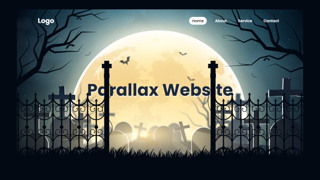
Hello! In this blog, we will learn how to make parallax scrolling website in HTML CSS and Javascript.
You know how website are always getting cooler and fancier? Well, one of the latest trends in web design is animated parallax websites when scrolling. These sites are like a visual adventure that unfolds as you scroll down the page. In this blog post, we’re diving into what animated parallax websites are, how they work, and why they’re shaking up the world of web design.
Video Tutorial:
What’s the Deal with Animated Parallax Websites?
An animated parallax website is all about creating a groovy and immersive web experience. It uses a technique called “parallax scrolling” to give you that feeling of depth and movement as you scroll. The key ingredients are:
Background Layers: These are like the backdrop of the website, usually filled with images or patterns. They move slowly, setting the stage.
Foreground Elements: On top of the background, you’ve got the main content, images, text, and other cool stuff. These elements move at a different speed, adding that wow factor.
Animations: This is where the magic happens. As you scroll, animations kick in, making everything come alive and interactive.
How Does It Work, Like, Technically?
Creating an animated parallax website is a bit like a wizard’s spell. It involves a mix of design skills, HTML, CSS, and JavaScript. Here’s a quick rundown of how it all happens:
Layering: First, designers create different layers for the webpage. These layers include background images, content sections, images, and interactive bits. Each layer has a specific role to play in making the site look amazing.
Parallax Scrolling Effect: The parallax effect is what gives the site its cool 3D vibe. It’s done with CSS and JavaScript, and it moves each layer at a different speed as you scroll. Background layers move slow, while the important stuff moves faster, creating that awesome depth effect.
Adding Animation: To make it even cooler, JavaScript comes into play. It’s the script that makes things happen. As you scroll down, animations kick in, making the whole experience more interactive and fun.
Keeping It Fast: Big animations can slow things down, so designers need to make sure the site loads fast and works smoothly. It’s like making sure your favorite game doesn’t lag.
The Impact on Web Design
Animated parallax websites are shaking up the world of web design in some pretty rad ways:
Visual WOW: These websites are a total eye catcher. They pull you in with their stunning visuals and make you want to explore the whole thing.
Storytime: Animated parallax scrolling website are like a storybook. They take you on a journey and reveal stuff as you scroll down. It’s like turning the pages of an online adventure.
Let’s Play: With all the animations and transitions, you’re not just a spectator, you’re part of the action. You can trigger animations, uncover content, and go at your own pace.
Branding Vibes: When done right, an animated parallax website becomes the face of a brand. It sets the mood and vibe that fits the brand’s style.
Keep Em Engaged: Cool design keeps people on your site longer. The more they stay, the more they might do what you want, like buy stuff or login.
No More Maze: Forget about clicking through a bunch of pages. With animated parallax sites, you can find everything you need by just scrolling down one page.
Tips for Making an Awesome Animated Parallax Website
If you’re thinking about creating one of these awesome sites, here are some tips to keep in mind:
Looks vs Speed: Find the balance between making it look amazing and keeping it fast. No one likes a slow website.
Simplicity Rules: Keep things clean and straightforward. Too much can be overwhelming, so don’t go overboard with animations and elements.
User-Friendly Nav: It should be easy for visitors to find their way around. Clear buttons, instructions, and smooth navigation are key.
Content is King: Everything you add should have a purpose. Don’t just put things there for the looks, make sure it’s all relevant.
Source Files – Starting Points
HTML Code – Starting Point:
<!DOCTYPE html>
<html lang="en">

<head>
    <meta charset="UTF-8">
    <meta http-equiv="X-UA-Compatible" content="IE=edge">
    <meta name="viewport" content="width=device-width, initial-scale=1.0">
    <title>Parallax Scrolling Website | Codehal</title>
    <link rel="stylesheet" href="style.css">
</head>

<body>


    <script src="script.js"></script>
</body>

</html>
CSS Code – Starting Point:
@import url('https://fonts.googleapis.com/css2?family=Poppins:wght@300;400;500;600;700;800;900&display=swap');

* {
    margin: 0;
    padding: 0;
    box-sizing: border-box;
    font-family: 'Poppins', sans-serif;
}
JavaScript Code – Starting Point:
let text = document.getElementById('text');
let treeLeft = document.getElementById('tree-left');
let treeRight = document.getElementById('tree-right');
let gateLeft = document.getElementById('gate-left');
let gateRight = document.getElementById('gate-right');
Conclusion
Animated parallax scrolling website are like a web design masterpiece. They create an immersive experience that keeps you scrolling, discovering, and exploring. As web design keeps evolving, these sites are a game changer, offering an unforgettable experience for users. When done right, they stand out in the digital world, leaving an impression that won’t fade anytime soon.
Buy This Project Complete Source Code From Here:
Buy This Project Complete Source Code From Here (By Paypal):

