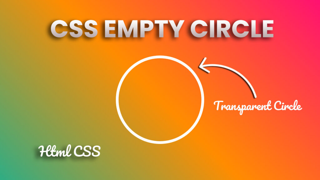
Hello everyone! In this blog, we will learn how to make empty circle in HTML CSS.
In the world of web development, we’ve got HTML and CSS, our dynamic duo that helps us create dope websites. But did you know about a cool hidden gem? It’s called the “empty circle,” and it can really up your web design game. So, in this blog post, let’s break down what this empty circle thing is, how you can make and personalize it, and where you can flex it in your web projects.
Video Tutorial of Empty Circle HTML CSS
Empty Circle in HTML and CSS.
What’s the Deal with Empty Circles in HTML and CSS?
Empty circles, when we’re talking HTML and CSS, are those perfectly round shapes with no text or content inside (transparent circle). They’re all about adding style or structure to your website. And here’s the secret sauce: we mainly use the “border-radius” property to create them.
The Lowdown on “border-radius”
This is where the magic happens, peeps. The “border-radius” property in CSS lets you round off the corners of an element. When you set the value to half of the element’s width or height, you get a circle. And when it’s set at 50%, bam, you’ve got yourself a perfect circle.
Personalize Those Empty Circles
Empty circles are super versatile, and you can totally customize them to match your website’s vibe. Here are the keys to pimping your empty circles:
Size Matters: You can make your empty circle any size you want by tweaking the width and height of the element. Keep em the same to keep things round.
Colors and Background: For some swag, set the “background-color” property to choose your circle’s color. Get wild with gradients, images, or patterns to make it pop.
Borders and Border-Color: If you’re feeling extra, add a border to your empty circle. Use the “border” property to set the border width, style, and color. It’s like adding a stylish outline.
Shadow and Glow: To make your circle stand out, throw in some shadows or glowing effects. The “box-shadow” property is your secret weapon.
Spice It Up with Animations: Take it to the next level by using CSS animations and transitions. You can give your empty circle some movement and interactivity.
Where to Show Off Your Empty Circles
Empty circles aren’t just for show, they’ve got mad uses in web design. Here’s where you can flex your empty circle skills:
1. Style Points: Use empty circles to add flair and balance to your web page’s layout. Pop em in headers, footers, or to separate different sections.
2. Icon Vibes: Empty circles are perfect for icons or symbols. Rock em for social media links, navigation menus, or as interactive buttons.
3. Loading and Progress: Animate your empty circles to create loading spinners or show progress. Keep your users in the loop about what’s happening.
4. Data and Charts: In data visualization, empty circles are your data points or markers on graphs and charts. Customize their look to show off your data.
5. Tooltips and Popups: Tuck in your empty circles to make tooltips or pop-up boxes. Hover or click, and you reveal extra info or fun stuff.
6. Call-to-Action Swag: Make empty circles into call-to-action buttons. Encourage users to take action, submit forms, shop, or whatever your site’s about.
7. Progress Bars: Show how far someone’s come by using empty circles as progress bars. Animations or filling them in gives visual feedback.
The Future of Empty Circles
Web design is always changing, and empty circles are going to stay in the game. With mobile-friendly and responsive design becoming huge, designers are figuring out how to make empty circles work on different screen sizes and orientations.
You Might Also Like This: Parallax Scrolling Website
Source Files – Empty Circle in HTML and CSS
HTML Code:
<!DOCTYPE html>
<html lang="en">

<head>
    <meta charset="UTF-8">
    <meta http-equiv="X-UA-Compatible" content="IE=edge">
    <meta name="viewport" content="width=device-width, initial-scale=1.0">
    <title>Empty Circle | Codehal</title>
    <link rel="stylesheet" href="style.css">
</head>

<body>

    <div class="circle"></div>

</body>

</html>
CSS Code:
* {
    margin: 0;
    padding: 0;
}

body {
    min-height: 100vh;
    background: linear-gradient(45deg, #00b4a2, #ff8c00, #ff0080);
    display: flex;
    justify-content: center;
    align-items: center;
}

.circle {
    width: 300px;
    height: 300px;
    background: transparent;
    border-radius: 50%;
    border: 10px solid #fff;
}
Conclusion
Empty circles in HTML and CSS are a real MVP in web design. They’re versatile, you can style them your way, and they have tons of uses, from jazzing up your layout to showing data. Once you get how to create and style them, you’ve got a dope tool to add some extra creativity and functionality to your web projects. Web design keeps evolving, and empty circles are right there, ready to make your site look slick and accessible to all.

